When I set out to design my personal website, I wanted it to do more than simply showcase my work – I wanted it to represent who I am as a creative professional. My goal was to build a cohesive and recognisable identity that blends digital marketing expertise, journalistic storytelling, and modern design.
This post outlines the brand strategy, visual identity, and stylistic framework behind my website – showing how every creative decision supports user experience, accessibility, and SEO performance.
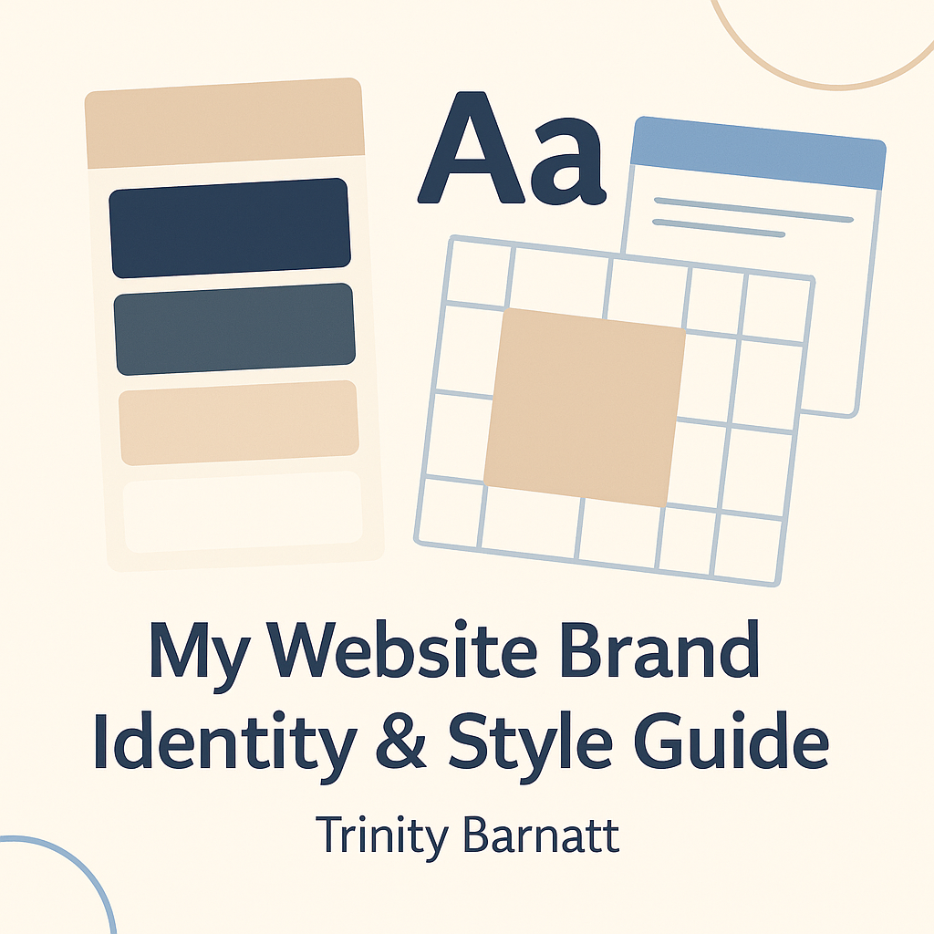
Defining My Brand Vision
My brand reflects the duality of my professional identity:
a balance between creativity and strategy, design and analytics, voice and data.
Through my website, I aim to communicate:
- Professional credibility – demonstrating my understanding of marketing, SEO, and visual communication.
- Creativity and originality – showing that I bring design thinking to every project.
- Approachability and authenticity – keeping the tone clear, confident, and personable.
Every colour, font, and layout choice ties back to this vision – ensuring my digital presence feels both purposeful and professional.
Brand Keywords
My visual and written tone is anchored by five brand-defining keywords:
Creative | Analytical | Minimal | Confident | Honest
These terms not only guide my design decisions but also shape the language used throughout my website and blog. By aligning design with linguistic tone, I ensure that visitors and search engines alike understand my brand identity at a glance.
Visual Identity & Colour Palette
A clear and consistent colour palette strengthens recognition and reinforces emotional connection.
Here’s how I developed mine:
| Purpose | Hex | Description |
|---|---|---|
| Background | #FAF7F4 | A warm ivory backdrop for an editorial, welcoming aesthetic. |
| Text/Foreground | #2C2C2C | Charcoal black for strong readability and contrast. |
| Primary Accent | #4A708B | Muted steel blue — professional, calm, and trustworthy. |
| Secondary Accent | #C7A589 | Soft taupe for warmth and approachability. |
| Tertiary Accent | #E0C3A2 | Sand tone for subtle highlights and visual balance. |
This muted, modern palette mirrors my professional style – blending digital polish with editorial sophistication —-while also maintaining WCAG accessibility compliance for clear readability across all devices.
Typography & Tone
Typography plays a vital role in expressing brand personality.
I chose a pairing that bridges editorial storytelling with digital precision:
- Headings: Playfair Display – elegant and authoritative, evoking a journalistic feel.
- Body Text: Montserrat – modern, versatile, and easy to read across digital platforms.
Together, they create a clean visual rhythm that communicates credibility while remaining approachable.
Tone of Voice
Across all pages, my content maintains a consistent voice that is:
- Professional yet personable
- Knowledgeable but approachable
- Authentic and confident
This tone aligns with my values as a digital marketer — creating trust, clarity, and connection for both human readers and search algorithms.
Logo & Visual Symbolism
My website logo — “Aspiring Digital Marketing Professional” — visually encapsulates my brand identity.
The design features a computer monitor, SEO magnifying glass, and growth chart, symbolising the analytical and creative synergy of digital marketing. The globe icon represents the global reach and connectivity of online communication, while the upward arrow reflects progress and professional growth.
The typography and iconography follow my brand palette and convey approachability and structure, reinforcing my personal mission: to bridge creativity with measurable digital impact.
Rather than using an abstract symbol, this logo functions as a statement of intent – showcasing who I am and where I’m heading professionally.
User Experience and Accessibility
Good design is only effective when it’s user-centred. My layout prioritises both function and inclusivity, ensuring visitors can access and navigate information easily.
Key UX and accessibility considerations include:
- Clear navigation menus with descriptive labelling
- Consistent button and hover styling
- High-contrast colour pairings for visibility
- Mobile-first responsive design
- Descriptive alt text for all images and graphics
- Accessible form fields and keyboard-friendly structure
These design choices not only improve accessibility but also strengthen SEO performance, as search engines increasingly reward sites with high usability and accessibility scores.
SEO Integration Through Design
SEO isn’t limited to technical setup – it’s embedded into every design decision.
Throughout my site, I’ve implemented best practices such as:
- Descriptive internal linking — using meaningful anchor text instead of generic terms like “click here”
- Concise, purposeful links — avoiding overlinking or keyword stuffing
- Logical internal navigation to guide users naturally through related content
- Balanced external and backlink strategy — linking to authoritative sources to improve trust signals
Each link adds value for the user and context for search crawlers, ensuring SEO contributes to both discoverability and experience.
For a deeper breakdown of these strategies, visit my full post:
👉 How I Used SEO Optimisation to Build My Website
Final Thoughts
My website’s style and brand identity represent more than just a visual framework – they tell the story of my professional journey.
Every design choice supports my broader goal: to merge creativity, marketing theory, and practical SEO skills into a clear, engaging, and technically sound online presence.
Whether I’m designing layouts, writing copy, or analysing performance data, I ensure every decision reflects both strategic intent and authentic expression – the essence of strong digital branding.
Related Links
Internal:
- How I Used SEO Optimisation to Build My Website
- Using Google Search Console for Website Optimisation
- Visuals & Design Work
- CV & Skills
External:


Leave a Reply